A department site contains several content types to provide flexibility in how you create pages as well as providing lists of people and events that automatically update when items are added, edited, or removed. Layout is available for several content types. Using layout gives you the ability to add sections with columns (single, two-column, three-column) as well as custom blocks (e.g. related links, quote, etc.). These blocks are pre-styled to appear as outlined below.
Content Types
-
Article (“News”) – Layout Available
-
Basic Page – Limited Layout Available
-
Event
-
Landing Page – Layout Available; does not have subpages (no left sidebar); has Masthead/Banner image field with a recommended size of 1440x400
-
Person
What You Can Do On The…
-
Edit Tab
-
edit title,
-
body field (may not be used),
-
path,
-
menu settings,
-
and publish status.
-
-
Layout Tab
-
Add layout sections (several column layouts available)
-
Add custom blocks and List Views to sections
-
Drag and drop blocks to different sections or columns
-
Edit content of custom blocks
-
Logging In
You will receive an email notice of your Drupal account activation. It will include your username and a one-time login link. Use the link and then click the "Use the one-time login" button to login and create a password in the "Password" and "Confirm Password" fields.
Remember to click "Save" or your password will not be set.
In the future, you can login to the admin area of your site at http://your-site-url/user/login (for example, http://cacs.virginia.edu/user/login).
Note that your account belongs to you, and only you. Do not share your account information. If others need access, request accounts for them.
Forgot your password? Go to your /user page (i.e., http://mysite.virginia.edu/user) and click on the tab 'Request New Password'.
Create New Content
Drupal breaks content up into types – basic, news, courses, etc. When creating new content, think about the type of content you are adding in order to know which type to choose. When adding or editing content, you will see a page with associated fields and settings. A field with a red asterisk is required.
A basic page is typically a simple page with text, and perhaps an image or two. It will not have multiple columns or more styled elements found using Layout (to use Layout, scroll to the Layout section below starting on Page 8).
To create a basic page:
- Go to Content – Add Content
- Select Basic Page
- Provide a title and optional banner image or feature image (Article)
- Provide Body content (for body content, see also section below ‘Using Headings, Button Styles…’
- Save (default status is Draft)
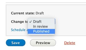
Save and Publish
Once you finish creating or editing content, scroll down to the Save button and press Save. If you just want the world to see it be sure the Published option is selected. If you need to keep working on the page before others see it, keep it as Draft.
Add Your Page to the Main Site Navigation
The main site navigation is found across the top of every site page, under your site title. It is how users will navigate to different pages of your site.
To add one of your pages to the navigation:
- Add a new page or edit an existing page
- In the right-hand column are several options
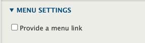
- Click Menu Settings – Provide a menu link
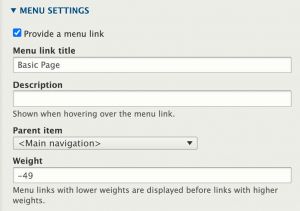
- The menu link title is automatically set by your page title; this can be changed if desired.
- Description is optional
- The Parent Item dropdown tells Drupal where in the navigation to add your page; the default ‘Main Navigation’ selection will appear to add the menu item to the top of your site.
- You can alternatively choose to place your page under one of the main items; this will create a sub-navigation which includes a dropdown and a left sidebar menu within that section.
-
Save your page, then view the page and/or homepage and ensure that the menu item to your page displays as desired.
Change the Order of Navigation
To change the order that items appear in your main navigation:
-
Hover over the main navigation; a Pencil icon will appear to the right of the navigation items
-
Click the Pencil Icon – Edit Menu
-
Use the drag handles on the left to move menu items up or down.
-
You can also drag an item to the right, underneath another item, to make it sub-navigation under that item.
-
Save your changes.
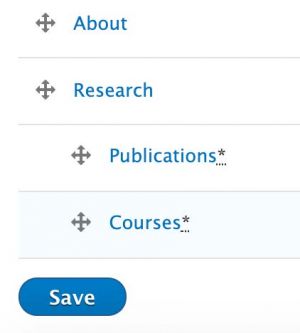
Tip: You can add menu items on this page as well by clicking the +Add Link button at the top left. You’ll need to know either the full URL (example: http://www.virginia.edu) or the path to your website page (example: /about-us)
Add Links to Documents using Media Browser
Adding documents to your Media library then linking to those documents within your webpage content is a two-step process.
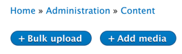
-
Go to Content > Media, then click +Add Media > Document to upload your new document. Alternatively, you can click Bulk Upload to upload multiple documents at once.
-
Once your document(s) is displaying in the Media library, now you can reference this document from any page on your site. Go into edit mode on that page, then:
-
In the Body field, highlight the text you want linked.
-

Click the Link icon and begin typing the name or title of your document; a prompt should come up with your document and/or others with similar names. Choose your document and click save.
-
Scroll to the bottom of the webpage and save your work.
-
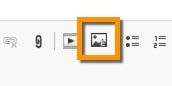
Add Images
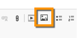
The media browser button in the WYSIWIG editor allows you to insert images within your basic text.
- Click the media browser button
- If the image you want is already showing, select it and click Place.
- To add a new image to the media page, click Upload – Choose File.
- Find the file on your computer, then click Open.
- Provide Alternate text for your image (description of what the image is); scroll to the bottom, and give your image a name.
- Click Place
- Under Image Styles, there are several sizes of images you can choose, which will alter the size of your image. If you want the original, select None.
- Your image placement defaults to the left, with no text wrapping around it. Choose Align – Left, Center, or Right to place your image accordingly, which will also allow text to wrap around the image if size allows.
- Click Embed, then save your page.
2.
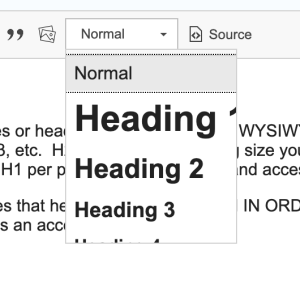
Headings
To create larger font subtitles or headings, you will use the WYSIWYG text editor and select the dropmenu titled 'Normal...'. In the dropdown are several options - H1, H2, H3, etc. H2 is the largest heading size you should use within your content (H1 is reserved for your page main title, and is automatically set. Only one H1 per page is recommended and accessible.) H3 is slightly smaller, and other headings smaller than that.
Website accessibility dictates that headings should be used IN ORDER (don't use an H2 for a subtitle, then use an H4 in the next line - you've skipped H3, and that creates an accessibility issue.)
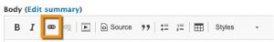
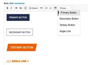
Button Styles
In the WYSIWYG editor of any text field, you may format links to appear as several different button styles. To create a button link:
-
Type the text of the link/button.
-
Select the text.
-
Click the insert link button:
- Paste in the URL for the link and press Save
- Select the link (click anywhere on the link) and press on the Styles option in the toolbar.
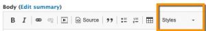
- Choose the button style you prefer.
Add Document Links
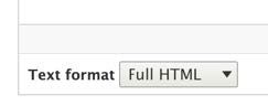
- In the WYSIWYG editor of the body or description field, first ensure that your field has the text format ‘Full HTML’ selected (underneath field).
- With your cursor placed the body field where you’d like your link to appear, choose the Document Icon
- IMPORTANT: the WYSIWYG editor/file upload works best if using Chrome,
- Firefox and Safari. Avoid Internet Explorer if you are adding images and/or files to your website.
Add Images to Your Basic Page Using Media Browser
The media browser button in the WYSIWIG editor allows you to insert images within your basic text.
- Click the media browser button
- If the image you want is already showing, select it and click Place.
- To add a new image to the media page, click Upload – Choose File.
- Find the file on your computer, then click Open.
- Provide Alternate text for your image (description of what the image is); scroll to the bottom, and give your image a name.
- Click Place
- Under Image Styles, there are several sizes of images you can choose, which will alter the size of your image. If you want the original, select None.
- Your image placement defaults to the left, with no text wrapping around it. Choose Align – Left, Center, or Right to place your image accordingly, which will also allow text to wrap around the image if size allows.
- Click Embed, then save your page.
- To edit your image selections, simply to back into Edit mode, and double click your image in the WYSIWIG editor.
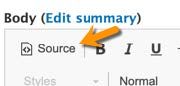
Use Source/HTML View
If you prefer to use HTML while building your pages, the Source button will switch the WYSIWIG editor to use HTML mode, rather than View mode.
Revisions
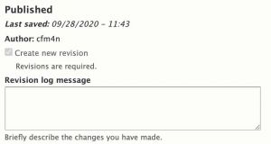
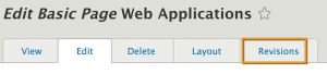
The settings menu on the right side of the edit screen provides options for revisions, menu settings, and URL Alias. Use the Revision log message to leave a note about what you changed. If you need to roll back to an earlier version of your page, this will help you know what changed when. You can view Revisions by selecting the Revisions Tab, which appears in the same row as View | Edit which in edit mode on a page.
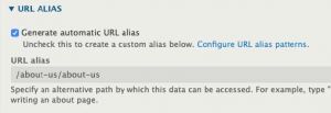
URL Aliases
The "URL Alias" tab allows you to manually change the URL for this content. Drupal automatically builds the URL based on the content title, so if you want it to be something specific, uncheck "Generate automatic URL alias" and supply your own.
To create a page with styled blocks or a different layout/number of columns:
- Go to Content – Add Content
- Select Article, Basic Page, or Landing Page
- Provide a title and optional banner image or feature image (Article)
- Optionally provide Body content
- Save (default status is Draft)
- To add styled features or different column formats, click on the Layout tab.
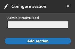
Add Sections
-
In the Layout Tab click Add section.

-
Choose a column layout.
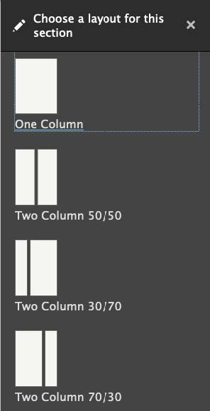
-
Provide an Administrative label (this will not show to site visitors) and press the Add section button.
Add Custom Blocks
- In the Layout Tab click Add block.

- In the upper right corner click Create custom block:
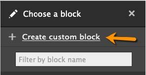
- Choose a custom block type to create.
- Complete the form fields for your needs.
- Press Save.
Note: Custom blocks may be moved via drag and drop into different sections or in a different order within a section.
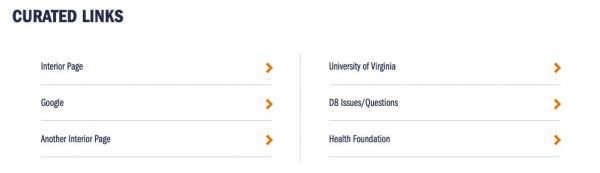
Curated Links
- Title
- URL (internal or external)
- Target
Data Header (can be used as a header for other sections)
Diagonal Call to Action (Landing Page full width only)
- Title
- Caption
- Link

Full Width Image (width of content section in which it is placed)
- Media image
- Caption
Video
- Embed with URL
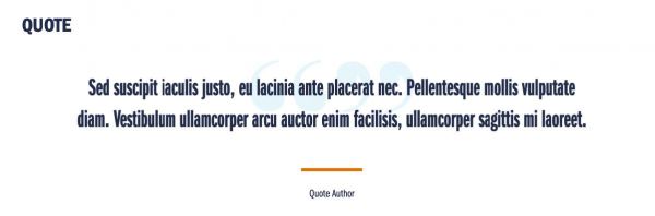
Quote
- Quote text
- Author
- In the Layout Tab click Add block

- In the right sidebar select the List (View) you would like to place.
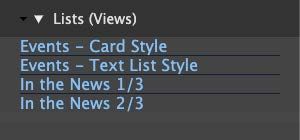
List (Views) Types
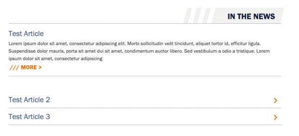
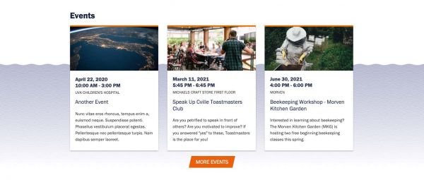
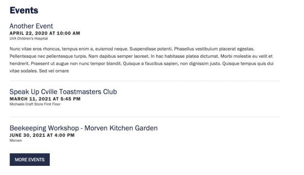
Events - Card Style (full-width only)
Events - Test List Style
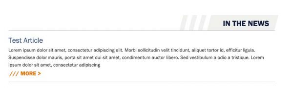
News 1/3 - shows header and first article
News 2/3 - shows articles two and three (skips one)
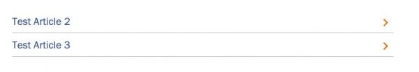
This allows you to build a section that looks like this: